


Eidos Design. Volume XIV: Accessibility As a Must-Have, mymind App Review, and Post-Internet Artifacts
Design that cares, tools that inspire, and artifacts that make us question everything.

Hello fellow designers, creatives, digital professionals and Eidos Design members!
July is already in full swing! I hope those of you in Europe are doing well after heat wave. With this new issue of Eidos Design Newsletter, we'll refresh ourselves!
July 2 is usually the midpoint of the year. It's a good time to revisit the goals we set at the beginning of the year and consider what can be changed. Do we need to speed up or is it time to slow down?..
In our case, however, we want to move even faster! We want the Eidos Design community to continue growing. Over the past six months, several hundred subscribers have joined Eidos, which makes me very happy and grateful. Eidos is consistently ranked in the Rising in Design category on Substack. And we just launched Eidos Doctor — a separate service to help designers looking for work on this difficult path.
Ultimately, it all translates into the likes, comments, shares, and appreciation you send us. So, I thank you in return! And I want to end this rather long introduction with a special thank you promised in our Leaderboard.
🎖 Honorable Mention
Thank you, Lilia Z., for taking the time to promote Eidos Design and introduce new designers to our community!
In this issue:
Accessibility as a Must-Have
Why the new European Accessibility Act turns “nice-to-have” guidelines into legal requirements every designer must master.
mymind App Review
A minimalist “second brain” that whispers calm — until its AI takes the wheel.
Post-internet artifacts
Seth Steinman’s post-internet artifacts remind us that every pixel still sits on ancient stone.
I. Accessibility As a Must-Have
Insight
The time has come! Accessibility is no longer just a bonus; it's now a necessity for all digital interfaces.
On June 28, 2025, the European Accessibility Act went into effect in the EU. This legislation requires companies to ensure digital accessibility. This includes all digital products, such as websites, smartphone and TV apps, ATMs, ticket machines, and the touchscreens of household appliances.
Violations will not be dismissed as mere technical glitches. Instead, they will result in real fines, lost market share, and legal liability.
Design is becoming a legal category.
Basic principles of accessibility (WCAG 2.1 AA) that you must know right away (if it’s not the case yet):
Text contrast ≥ 4.5:1
Alt texts and explanatory tooltips
Full keyboard navigation
Visible focus, skip to content, consistent navigation, and visible errors
User control
Compatibility with screen readers
As designers, we should pay special attention to the following:
Color contrast — according to WCAG 2.1 AA.
Clear links: Avoid “click here”. The link text should describe an action.
Heading hierarchy: Logical structure (in both design and code) is more important than appearance. For example, h1 can only appear once per page.
Keyboard navigation: All buttons have a clear focus state.
Compatible with screen reader: Semantics and aria-labels.
Video alternatives: Subtitles and transcripts.
In this context, I'm reminded of airline websites, which offer some of the worst user experiences around. Low-cost airlines like Ryanair, EasyJet, and Wizz Air are the worst. They use dark patterns, try to sell you something at every turn, and make buying tickets as difficult as possible, hoping users will make mistakes.

To understand why accessibility is important for businesses, I recommend watching this talk by Piccia Neri, "The EAA is coming to bite you in the Arse." If you haven't yet gained accessibility expertise or at least a basic understanding of the Web Content Accessibility Guidelines (WCAG), don't delay. Take courses and consult with experts to get answers to all your questions on the topic.
II. mymind App Review: Minimalism Meets Memory, or Just a Stylish Black Hole?
Product Review

Reminder: Product evaluation is done according to Don Norman's 3 levels of design.
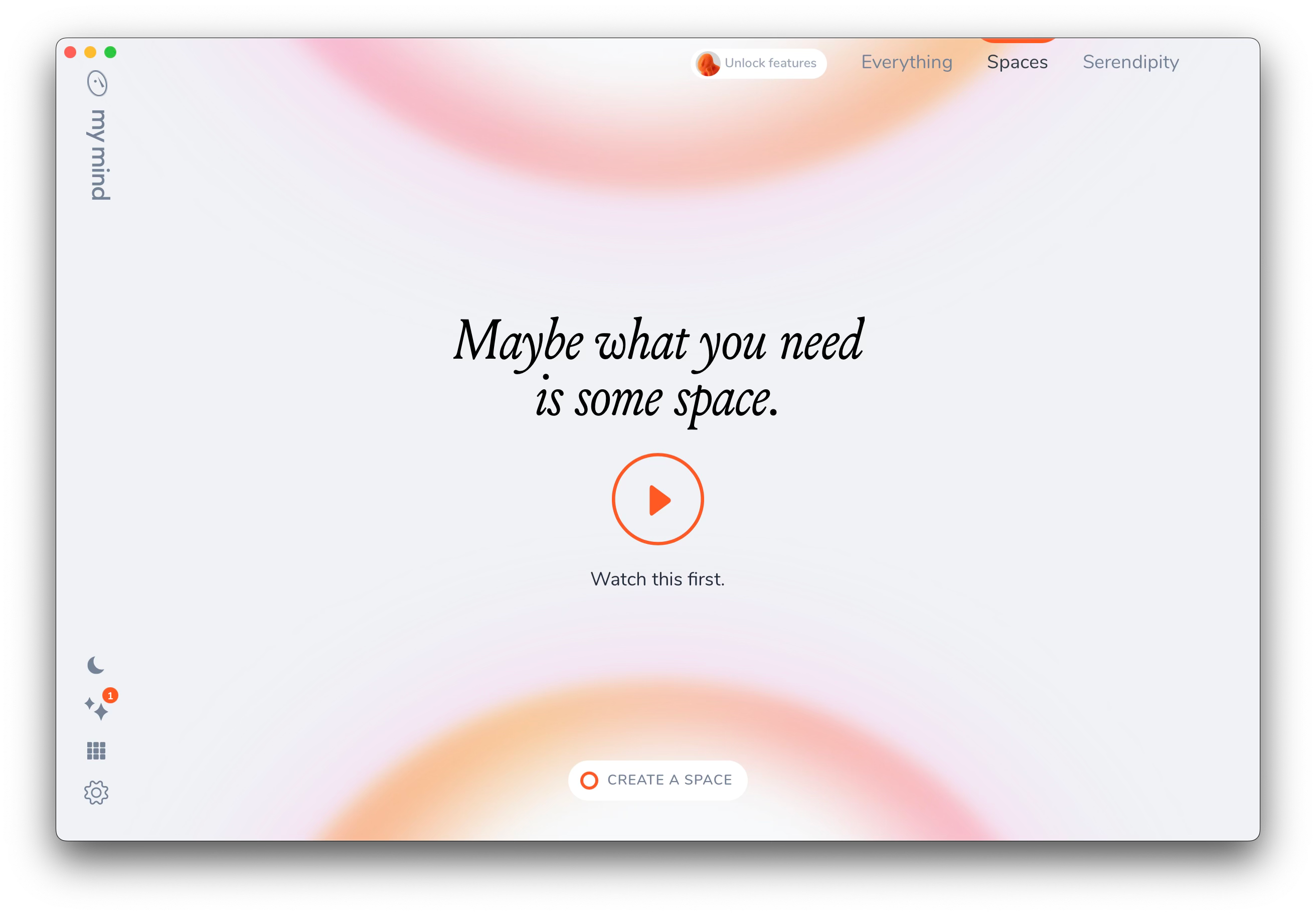
This month, we’re diving into mymind, a minimalist note-taking and idea-saving app that calls itself “a second brain.” It’s been gaining quiet momentum among designers, writers, and digital thinkers who crave a calmer, more aesthetic alternative to cluttered productivity tools.
mymind promises a frictionless space for your thoughts, visuals, and inspiration — no folders, no labels, no chaos. But does it really work as effortlessly as it claims, or does the elegance mask deeper usability trade-offs?
Let’s unpack it through our familiar design lens.
Visceral level: 5/5
The visceral level is responsible for first impressions.

Opening mymind is like walking into a minimalist design gallery. The color palette is understated — mostly black, white, and soft tones. It gives a sleek, modern aura. But it’s more than just aesthetics: the lack of clutter immediately communicates calm and focus.
It doesn’t scream for attention. It doesn’t onboard you with popups or nudges. It simply is. A confident, almost arrogant silence, and that’s refreshing in a world of dopamine-chasing apps

I will probably use this app as an example of perfect design. Its clean and simple design is compelling and memorable thanks to its details. It's minimalism with a wow effect!
Behavioral level: 5/5
This level focuses on usability — how the product performs and whether it effectively solves user problems.
mymind markets itself as a “second brain” — a space where you save what matters, without worrying about folders, tags, or structure. You just… drop things in. A quote. An image. A link. A thought. And mymind’s AI does the rest — auto-tagging, categorizing, and making everything searchable.

This approach is bold. Liberating, even. There’s no pressure to organize or label, you trust the system to make sense of it later. For visual thinkers, creatives, and digital magpies, it’s a dream.
And here's the moment when reality strikes back. Not that harsh, though 😁
While the experience is seamless and visually elegant, the lack of structure and flexibility in creating the system can become a double-edged sword. If you’re a control freak, this app might slowly drive you mad. It’s just a collection, a gallery of things, that you can’t fully control. You can’t really tweak the metadata. You can add your tags, and delete the auto-generated ones, no fast ways (like just renaming). I mean, it's one of those cases where you feel like the AI is in charge. But it does its job well!
It’s the anti-Notion app. And that’s both its strength and its limit. It’s not about task management or productivity. It’s about inspiration, collection, and calm curation.
Also worth noting: syncing across devices is fast and reliable, and the mobile experience feels just as polished as desktop — no small feat for a note-taking app.
Reflective level: 5/5
The reflective level considers the long-term impression and deeper meaning of the design — how it aligns with the user’s identity and values.
The app is more than just a tool; it's a whole philosophy. It's hard to say if the philosophy is new, but the app's implementation of it is amazing. It’s for people who are done with clutter, who don’t want another dashboard. But also who don’t need control and customization.
It reflects a deeper cultural shift toward mindful digital spaces. It asks: What if collecting thoughts could feel like art? What if the place where you save your ideas could be beautiful — even meditative?
Questions like these mark this app as outstanding on a reflective level. Frankly, I am inspired by the beauty of this digital mind.
Using mymind long-term is like creating a quiet, personal museum of everything that inspires you. It's not just something you use — it's something you inhabit.
Of course, it’s not for everyone. Power users might find it lacking. But for those craving simplicity in an overly complicated world, mymind offers something rare: a design that respects your attention.
Overall: 5/5
Hold on! We have another app with a 5/5 rating! Woohoo!
Yeah, mymind is not a tool you “use” — it’s a space you step into. It's a safe haven for your digital brain. It’s not built for productivity hacks or collaboration. It’s built for you, and only you. And in the end, it’s the experience that made me to write this review in this specific way, using metaphors and all the possible ways to highlight the beauty of this product. In a sea of apps that shout, mymind whispers, and sometimes, that’s exactly what we need.
III. At The Edge of The Digital, We Return To Stone
A Dose of Inspiration
As designers, we often rush toward the next big thing: sleeker interfaces, smarter systems, and cleaner code. However, real inspiration sometimes comes not from what’s ahead but from what’s beneath our feet.
Seth Steinman, a sculptor and painter, invites us to rethink how technology feels. Rather than chasing hyper-efficiency and polished minimalism, he turns to the origins of technology — stone and wood, merging them with digital nostalgia. Imagine the Windows XP startup screen projected onto cracked rock. MS Paint. Dozens of Safari tabs carved into rough wood.

His work is a rebellion — not against technology, but against its sterilization. He asks: What if our digital memories had weight, texture, splinters?
There’s something deeply human in Steinman’s approach — a bridge between our current interfaces and the primitive tools that built civilization. A reminder that everything new stands on something ancient.
And this is it for today,
I hope this issue nudged you to double-check color contrast in your designs, or rethink your note-taking habits and how we collect digital things.
As always, I’d love to hear your thoughts — hit reply, leave a comment, or share the newsletter with a friend.
Need career clarity? Remember that Eidos Career Doctor is now live for free portfolio & CV reviews. Let’s keep fixing what’s broken in the design world.
As always, this newsletter is free, but if you enjoyed it, please consider sharing it with a friend or two. Spreading the love is what it's all about, folks.
Sincerely,
Vadym Grin
This is a beautiful, poetic article. It helped me to break free from the rigid framework of the digital world, inspiring me to view design through the lens of humanity and empathy. Thank you!
nice, thanks for recommending the app, very cool review, I've already installed the app 👌🏻