


Eidos World. Volume VI
Instagram of the 90s, the history of Zippo lighter design, how to measure usability, and a product review
Finally, we meet again in this latest issue! I'm going through a major change in my career and will be embarking on a new adventure in a few weeks' time. As with any new challenge, this one promises to be even more difficult and requires a wide range of knowledge and perspectives. That's why half of today's issue is about designing real things, not digital ones. It is by looking at other areas that we can learn from something new. The second part of the issue is dedicated to usability measurement and, as usual, a product review. Enjoy the read!
I. 90's version of Instagram
The Da Vinci is a portable device developed by the Japanese company King Jim in 1990 that combines a camera with a built-in printer. It works in a similar way to the world-famous Polaroid SX-70 camera, whose snapshots can still be found in the photo albums of many families around the world.

However, the quality of the Da Vinci's images was far inferior to that of the Polaroid. This was a deliberate move by the Japanese developers, who positioned the device not as just another camera, but as a “graphic means of recording and storing reality, a method of communication”. It didn't have a viewfinder, instead the user had to point the camera lens at a specific object and press the shutter to get a printed photo preview measuring 14×19 mm. And then the killer feature was the ability to edit the image: centre the frame, colourise the photo or apply one of the available photo filters. After these manipulations, the final image is printed at a size of 67×76 mm.
Although it won the prestigious Good Design Award in 1990, the Japanese Da Vinci was not a commercial success. The voracious machine ran on up to 8 batteries, which had to be replaced frequently. Photos quickly faded on fax paper and the case was unreliable.
Nevertheless, the Da Vinci was one of the first attempts to combine the ideas of instant photography, rapid editing and social networking in one device. This combination of ideas was never successfully embodied in a physical device, but was “captured” 20 years later in the smartphone application that we know as Instagram.
Here you can see the device in 360°.
II. Zippo lighter history
George Blaisdell was co-owner of an oilfield equipment company and had worked with metal all his life. One day he saw a friend struggling with an old Austrian Hurricane lighter, trying to get the lid off and light his cigarette. George asked his friend: “Why don't you buy a modern lighter?" The friend replied: "Why, if this one works?”

Blaisdell's entrepreneurial spirit was awakened. At first he decided to sell the Austrian lighter to Americans because it “just worked”. After not selling a single one, George had an epiphany. He remembered his friend's attempts to open the lighter and the need to hold the lid with the other hand while lighting a cigarette. It was all very awkward. No, he didn't see a revolutionary new lighter, and he didn't need new technology to make something completely different. He simply decided to make the top of the lighter hinged rather than completely removable.
Blaisdell took an Austrian-made petrol lighter and made a few changes. Firstly, he added a hinged lid that allowed a cigarette to be lit quickly with one hand. Second, he changed the shape of the lighter to make it more comfortable to hold and more modern looking. Even the famous windproof technology was not new—the walls protecting the flame were already in the Austrian prototype.
Blaisdell founded the factory in 1932, initially employing just 6 people. He wanted to call the company “Zipper”, but it turned out that the name had already been taken by a company that made zippers for clothes. It is likely that the name "Zippo" was inspired by the sound of his product - the flick of the lid. It was this sound that made the lighter truly musical. Connoisseurs and collectors can identify its clicks by ear, and Eric Clapton and Sting used Zippo as a musical instrument in the song “It's probably me”.
Sales took off. The lighter, which was handy and always worked, was in great demand. Three years after its introduction, Blaisdell offered customers the opportunity to have personalised engravings, initials and custom drawings. All at very affordable prices—under a dollar. A reliable, high-quality product became truly personal, and the owner could become attached to it. More advertising followed: corporate branding and collectibles, contracts with the US Army and Navy. It was American soldiers who spread Zippo's fame around the world during the Second World War and the Vietnam War.
The lifetime guarantee became the company's most important marketing tool. If you have a Zippo lighter that is decades old and hasn't worked for a long time, you can send it (at your own expense) to the Zippo Manufacturing Company in Bradford. They will repair it and send it back to you (at their expense). The only things not covered by the warranty are the drawings and the exterior of the product.
III. How to measure usability
How to measure the effectiveness of design on the high level?
There are many frameworks for measuring the quality of product design. However, one of the most popular today is the HEART method proposed by Google in 2010.
H for Happiness: how do people feel about a product? To answer this question, surveys are conducted and user satisfaction is monitored.
E for engagement: how do people use your product? Quantitative research helps to answer this question, for example how many active users a product has in a week.
A for adoption: the number of new registrations over a period of time. This can also be determined using quantitative data from Google Analytics, Hotjar, etc.
R for Retention: the number of users who repeat an action (i.e. use a particular feature over and over again).
T for Task Success: completion of the task. The success rate is most often determined during user testing. If the majority of your users have completed the tasks set during user testing (search, filter, add to cart, buy, etc.), then your design solutions can be considered valid and effective.
Tools to measure usability and design effectiveness
User Interviews: Start by diving deep into the world of your users. Understand what ticks for them—their needs, likes, and what makes them click away in frustration. Grounding your design in solid user research is like having a map in an unknown city.
User interviews are a qualitative research method used to gather insights and feedback directly from users. During a user interview, a researcher engages with individual users or small groups to explore their experiences, preferences, needs, and pain points related to a product or service.It's better to conduct user interviews when:
There is a need to gain deeper insights into users' behaviors, motivations, and pain points.
Designers need to validate assumptions and hypotheses about user needs and preferences.
There is a desire to involve users in the design process and ensure that the final product meets their expectations.
Heuristic Evaluation: Here’s where you bring out the UX checklist and see how your design stacks up against the gold standards. Scrutinize your interface, navigation, content—everything, through the lens of established usability principles.
Heuristic evaluation is an inspection method used to assess the usability of a digital product or interface. During a heuristic evaluation, designers review the interface against a set of recognized usability principles or heuristics. These heuristics, often based on established usability guidelines, help evaluators identify potential usability issues and areas for improvement.
Heuristic evaluations can be conducted at various stages of the design process, including:
It's better to conduct heuristic evaluations when:
The design drafts are ready and there is a need to identify usability issues and areas for improvement in a digital product or interface.
There is limited time and resources for conducting more extensive usability testing with users.
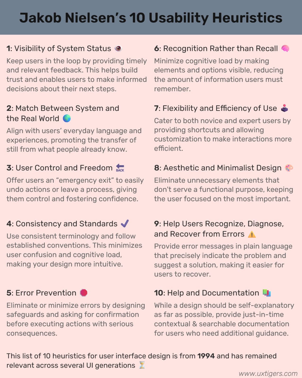
And by the way, it's been 10 years since Jakob Nielsen came up with these rules. Learn more about 10 usability heuristics for user interface design here.
Iterative Usability Testings: Think of your design as a work in progress, always. Test early and often with real users, and treat their feedback like gold. It’s about evolving your design based on real-world use, not just good intentions.
Iterative testing is a user-centered design approach that involves testing a digital product or interface repeatedly throughout the design and development process. Unlike traditional testing methods that occur at specific milestones, iterative testing involves conducting tests continuously and making incremental improvements based on user feedback.
During iterative testing, prototypes or early versions of the product are tested with real users to identify usability issues, gather feedback, and validate design decisions. This testing can take various forms, including usability testing, A/B testing, and prototype testing.
It's better to conduct iterative testing when:
There is a need to gather continuous feedback from users throughout the design and development process.
Designers want to identify usability issues early and make iterative improvements to the design.
There is a desire to ensure that the final product meets user needs and expectations.
User Feedback Integration: Keep your ears to the ground and listen to what users are saying. Their firsthand experiences are the most accurate measure of your product’s usability. Regular feedback, whether through surveys, interviews, or forms, is like continuous GPS guidance for your design journey. Look at metrics like how quickly users can complete tasks, how frequently they make errors, and whether they stick around or bounce off. These numbers show you where your design sings and where it might stumble. Feedback integration is possible with additional tools, like Hotjar or Pendo.
It's better to run user feedback sessions when:
After product launch and throughout its life.
Arm yourself with usability testing tools for the hard data on how users interact with your product. These tools help spot trends, gauge task success, and identify friction points, offering a clear view of where your design needs polishing.
Together, these tools and strategies form a comprehensive arsenal for measuring and enhancing usability, ensuring your product not only meets but exceeds user expectations.
IV. Product review
Midjourney

I usually tell you about great products that end up getting pretty high marks from me. Today I have decided to talk about a product that has fundamentally changed my work and my approach to creating graphics, but which is terrible in terms of user experience. And among other apps we've reviewed, this one is not a mobile, but a web one. Today in this chapter we are going to look at AI Image Generator-Midjourney.
It's hard to know where to start with this story. But let's start with some context. Midjourney is an AI-driven service developed and hosted by the San Francisco-based independent research lab, Midjourney, Inc. Similar to OpenAI's DALL-E and, Midjourney generates images based on natural language descriptions, known as prompts. This technology is part of the AI boom.
The tool is currently in open beta, which began on 12 July 2022, but the tool is already profitable (also since 2022). Users can create artwork with Midjourney using Discord bot commands known as "prompts".
This is where our interesting journey begins. Midjourney launched his own website some time ago. It has a personal account and the long-awaited ability to create images outside of Discord.

The thing is that Discord (analogous to Slack) is very clumsy. Its navigation and features leave a lot to be desired. It feels like one of those products made by developers for developers, with designers arriving much later.
The image creation feature has been in alpha testing for a long time and is not yet available. So you can just close this page as completely unnecessary and go to Discord.

On Discord itself, you end up on a huge pile of channels where people are generating their pictures. And your request just gets lost in the stream of lightning-fast generation.
If you have a paid account, you can enjoy the comfort of solitude in the Midjourney bot.

However, before you can enjoy really high quality results, you should take a young fighter course. For really good results, you will need various technical commands for the bot, which you will have to look for separately. For example, there are cheat sheats like this one.
Not only the work with the prompts, but also the finished picture leaves a lot to be desired. Among the generated variants, you get a huge hodgepodge of different buttons, the purpose of which is not always clear the first time you use it and requires some learning. For example, arrows and a “Web” button instead of “Export”. Of course, some tweaking of the UI and words would not go amiss here. Perhaps this will be considered in the future.
Discord has no aesthetics, of course. It is depressing in its unwieldiness and complexity. However, the benefits to you as a designer can be enormous. I create images for various articles, presentations and design layouts, and Midjoyrney has become indispensable. It saves hundreds of hours when you need wow graphics and it is legitimate to use AI tools.
Value: 5+/5
Usability: 2/5
Aesthetics: 1/5
And this is it for today
Well, I hope this issue has provided you with new practical knowledge as well as interesting insights from outside digital design. In our field there is a notion of a designer's visual experience. It refers to how many different products, interfaces, films, games, books and other visual experiences a designer has seen. This visual experience enriches them and allows them to apply previously seen patterns and techniques to their own practice. And I hope articles on Eidos are part of that development for you!
As always, this newsletter is free, but if you enjoyed it, please consider sharing it with a friend or two. Spreading the love is what it's all about, folks.
Sincerely,
Vadym Grin