


Glassmorphism at Apple: New Old Trend And New Old Troubles
Why beauty alone isn’t enough and how the new glassmorphic UI affects usability, accessibility, and the future of digital design.

Retro aesthetics are fun! As someone who used to enjoy designing skeuomorphic iOS icons, I’m excited to see digital design embracing artistry again. However, beauty shouldn't come at the expense of functionality.

Apple's new “Liquid Glass” UI is going to be a real head-turner. It's going to be available on iOS, macOS, watchOS, and VisionOS. Picture translucent frosted panels, floating menus, and soft voxel-like highlights, all inspired by Vision Pro's spatial OS. On paper (and in the demo), it's got a classy look. But it’s also buggy.
The design community’s reaction is far from uniform:
Aesthetic applause, usability alarm: Some hail the glassy look as “gorgeous”; others complain it’s distracting, difficult to read, and tiring on the eyes.
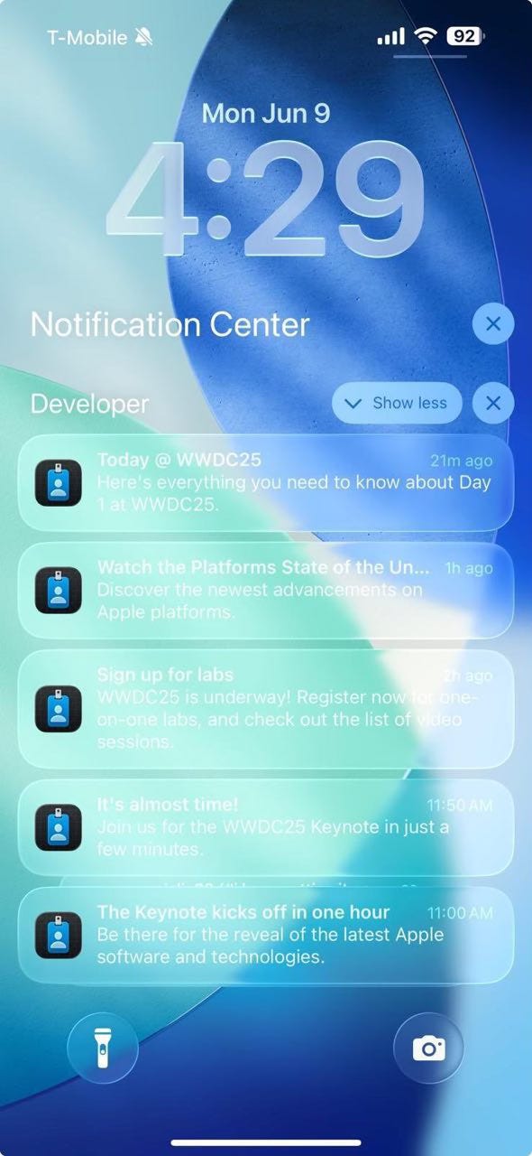
Accessibility under fire: People with visual impairments have reported serious contrast issues. A lot of users are finding that notifications and labels are blending too much with the background. I totally get it, looking at this:

The halo effect in action: Some say Apple merely repackaged an outdated trend — glassmorphism is the new skeuomorphism. And Apple did it just because they can.
What This Says About Design
Good design solves new problems, not old ones.
The shift toward transparent objects is all about style, not practicality. Elegance should make communication clearer, not harder to understand.
Form vs. function: The age-old battle
The “click-worthy” glass effect may win hearts (maybe not), but if users struggle to read or focus, we've created modern digital art, not a tool.
You have to test out bold moves carefully.
It's really important to get feedback from designers and accessibility testers during the beta phase. Apple has always made accessibility a priority. It's not that hard to fix smudging clarity right off the bat.
The return of a trend isn't the same as innovation.
Glassmorphism felt fresh years ago. There's nothing wrong with dusting it off, but being a mature designer means more than just being nostalgic. It means being relevant.
The Verdict
Glassmorphism can be a storytelling tool, but only if clarity isn’t sacrificed for charm.
What do you think? Is Liquid Glass just another flash in the pan, or is it the real deal? I'd love to hear your thoughts, good or bad!
Sincerely,
Vadym Grin
It's so good to read real criticism that goes behind hot takes for the likes. I 100% agree with you, that are numerous challenges with you and perhaps they weren't ready yet to be released, but I do appreciate the boldness of it, and I personally also really like it, specially some details I've seen around.
In the end, the history repeats itself. People hate it. People love it. It evolves with time and we all get used to it.