Making Design Accessible: Your Guide to the European Accessibility Act
A practical guide to navigating Europe’s accessibility laws
The European Accessibility Act (EAA) has become a reality. This legislation, approved back in 2019, officially came into effect on June 28, 2025. And if you're designing any digital interface for European users, it's definitely going to impact your work.
It already affects my projects for some time, so I decided to dig in — not with a sigh, but with curiosity. Because while it might seem like just another compliance chore, accessibility done right makes your design better for everyone. It’s not red tape — it’s better tape. When you design with accessibility in mind, you solve real problems for real people. You also future-proof your work and potentially reach new audiences.
Nevertheless, that doesn’t change the fact that navigating accessibility requirements can feel overwhelming. The standards seem complex, and the terminology is confusing. And sometimes, you just don’t know where to begin.
That’s exactly why I put together this guide. It's designed specifically for fellow designers who need to understand what the EAA actually means for their day-to-day work. I'll break down the current accessibility requirements in plain language and show you practical ways to comply.
Ready to make your designs work for everyone?
What is Digital Accessibility?
Sure, no need to define the concept of accessibility. Our modern society is well aware of the importance of designing products, services, and environments that cater to people with the widest range of abilities and needs.
And it’s not just about people with permanent disabilities like vision loss or mobility impairments. I remember how difficult it was for my best friend to complete simple routine tasks, as well as using a computer, with a broken arm.
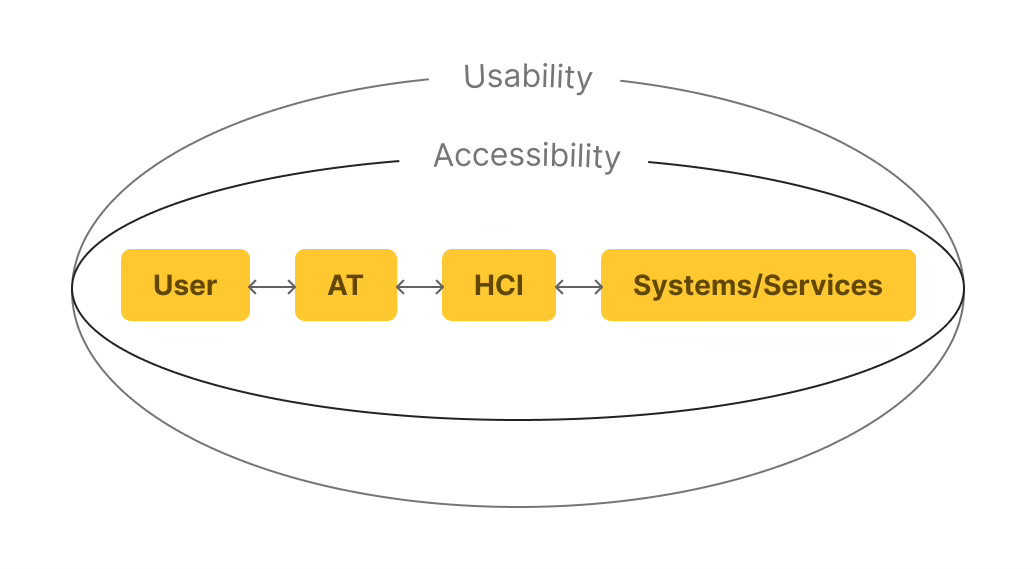
Therefore, accessibility is not about disability; it’s about usability for all.
Digital accessibility takes these principles into the online world. It means creating websites, apps, and tools that work well for everyone. Whether someone navigates with a screen reader, requires larger text, or prefers simpler navigation, your digital products should work for them.
In a nutshell, it’s about giving everyone equal access to info and opportunities. Making digital experiences accessible means helping people fully take part in education, work, and everyday life.
Technologies That Help Achieve Accessibility
There are two key components that make digital accessibility work: Assistive Technologies (AT) and Human Computer Interfaces (HCI). AT covers things like screen readers, zoom tools, and high-contrast modes. HCI creates the bridge between users and systems, ensuring these assistive tools can interact smoothly with your digital products.
What Designers Need to Know: Core Requirements of the EAA And Tools for Accessibility Testing
Okay, let's talk about what the EAA actually wants from us designers and how we can give it.
The European Accessibility Act (EAA) is built on a simple, yet powerful idea: Design should work for everyone. No exceptions, no afterthoughts. This is why every design is expected to be:
Perceivable — Can people actually see or hear the content?
Operable — Can they navigate and interact with it, regardless of ability?
Understandable — Is the interface clear and predictable?
Robust — And does it work no matter what device or tool they're using?
These POUR principles are closely related to the Web Content Accessibility Guidelines (WCAG) 2.1 and 2.2 - the technical standards for accessible digital design. Now, let's explore what matters most according to these standards.
Make Everything Readable 📝
Your images need to tell their story twice — once visually and once through alt text (text alternative). This matters because screen readers can’t figure out what your visuals mean on their own.
Write for context, not appearance. Don't write "image of a woman smiling." Write "Sarah Chen, Head of Marketing, presenting quarterly results." The aim is to share the same info a sighted user would get from the image.
Keep it snappy but complete. Aim for under 100 characters when possible. Screen readers announce "image" automatically, so don't start with "image of" or "picture of."
Decorative images get empty alt text. That background pattern or decorative flourish? Use alt="" (empty, not missing). This tells screen readers to skip it entirely.
Complex images need more thought. Charts, graphs, and infographics need the key data points in the alt text. "Bar chart showing 40% increase in mobile traffic from 2023 to 2024, with mobile now representing 65% of total visits."
Don't forget functional images. That magnifying glass icon for search? Alt text should say “Search,” not “magnifying glass.” Describe what it does, not what it looks like.
Form elements need labels too. Every input field, button, and interactive element needs a programmatic label that describes its purpose.
Quick test: Close your eyes and have someone read your alt text. Do you understand what's happening on the page?
Design for Mouse-Free Navigation 🐁🚫
Not everyone uses a mouse. Some people navigate entirely with ⌨️keyboards, 🗣️voice commands, or📱switch devices. Every button, menu, input box, etc, must be reachable and usable without a single click.
Here's how to test this stuff properly:
Keep reading with a 7-day free trial
Subscribe to Eidos Design to keep reading this post and get 7 days of free access to the full post archives.


